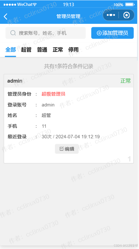
文章目录
- 1、简介
- 2、安装
- 3、测试
- 3.1 创建折线图
- 3.2 添加和自定义渲染器
- 3.3 添加图例、文本和批注
- 3.4 自定义您的绘图
- 3.5 矢量化字形属性
- 3.6 合并绘图
- 3.7 显示和导出
- 3.8 提供和筛选数据
- 3.9 使用小部件
- 3.10 嵌入Bokeh图表到Flask应用程序
- 结语
1、简介
https://bokeh.org/
https://github.com/bokeh/bokeh
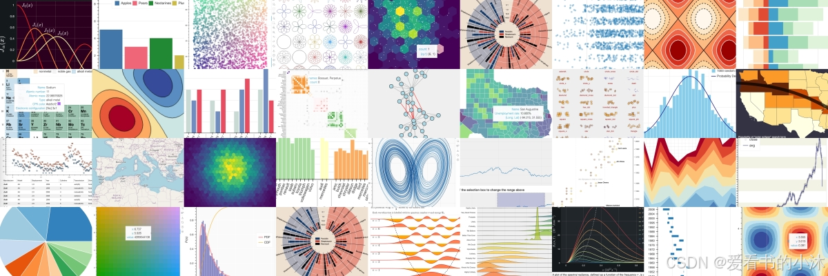
Bokeh是一个Python库,用于创建交互式的、现代化的Web可视化工具。它允许用户创建各种类型的图表,包括线图、散点图、柱状图、热图等,而且这些图表都可以在Web浏览器中交互式地操作。

Bokeh 是用于现代 Web 浏览器的交互式可视化库。它提供了优雅、简洁的多功能图形结构,并在大型或流数据集之间提供高性能交互性。Bokeh 可以帮助任何想要快速轻松地创建交互式绘图、仪表板和数据应用程序的人。
-
交互性:Bokeh提供了丰富的交互性选项,使用户能够在图表上进行缩放、平移、选择数据点等操作。
-
现代化的外观:Bokeh的图表外观非常现代化和吸引人,可以定制颜色、线条样式等。
-
多种输出格式:Bokeh支持多种输出格式,包括HTML、Jupyter Notebook、交互式应用程序等。
-
无需前端开发经验:使用Bokeh,不需要具备前端开发的经验,就可以创建交互式的Web可视化。
-
支持大数据集:Bokeh能够有效地处理大数据集,因此适用于各种规模的数据分析任务。
Bokeh是一个用于数据可视化的强大工具,它能够创建交互式、高性能且具有各种可视化样式的图表。Bokeh提供了Python、R、Scala和Julia等多个编程语言的接口,使得用户可以根据自己的喜好选择使用。
在将Bokeh绘图嵌入到网站中之前,我们需要将绘图文件上传到网站的服务器。一种常见的方法是将绘图作为静态资源存储在服务器上,并在网站的HTML代码中引用它。
2、安装
请在 Bash 或 Windows 命令提示符下输入以下pip命令:
pip install bokeh

3、测试
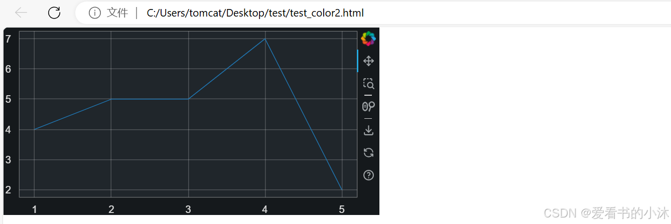
3.1 创建折线图
Bokeh允许您使用Python构建在web浏览器中运行的交互式可视化。为了实现这一点,Bokeh包含了一个名为BokehJS的JavaScript库。BokehJS负责在浏览器中呈现可视化效果。
当您在Python中使用Bokeh创建可视化时,Bokeh会将此可视化转换为JSON文件。然后,这个JSON文件被发送到BokehJS,BokehJS在浏览器中呈现可视化效果。
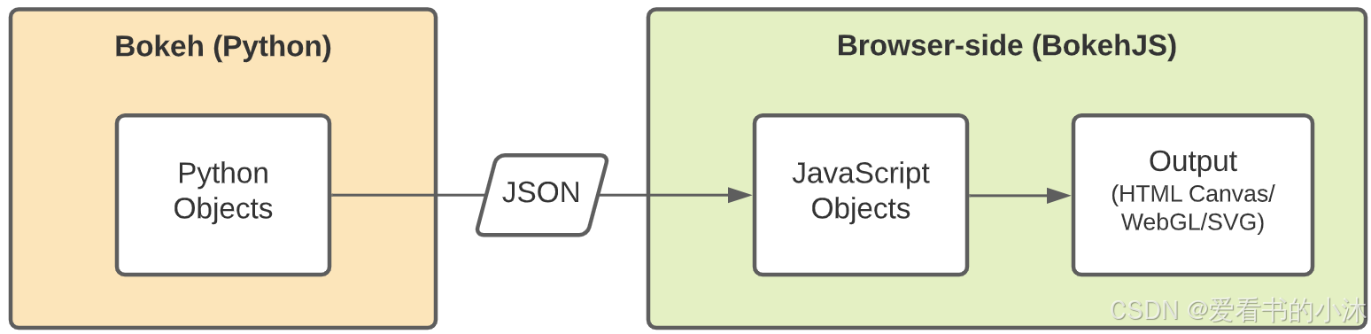
在Python中使用Bokeh,它会自动生成BokehJS代码。但是,您也可以在JavaScript中直接使用BokehJS。

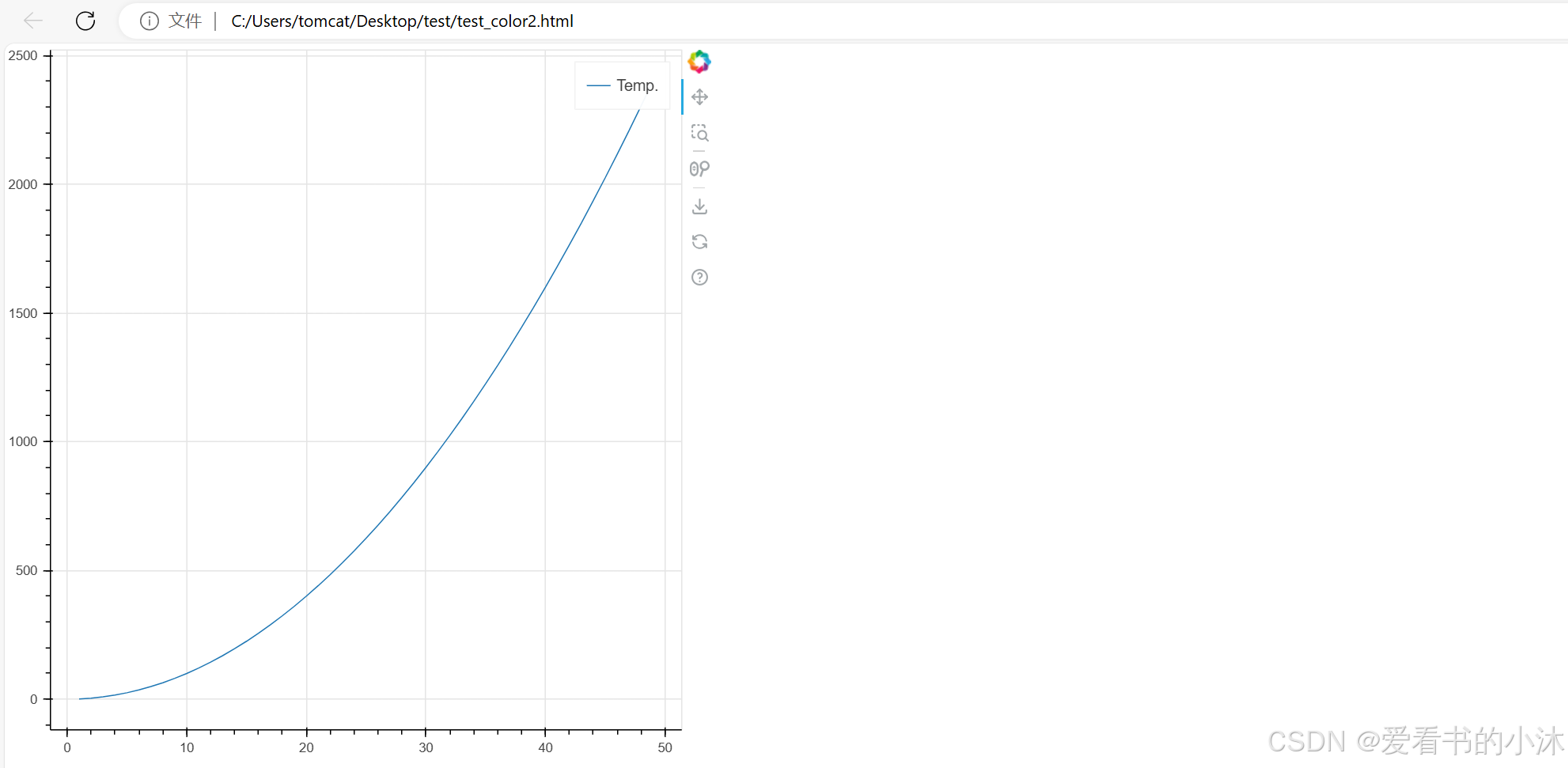
from bokeh.plotting import figure, show

# generate some values
x = list(range(1, 50))
y = [pow(x, 2) for x in x]

# create a new plot
p = figure()
# add a line renderer and legend to the plot
p.line(x, y, legend_label="Temp.")

# show the results
show(p)
from bokeh.plotting import figure, show
# prepare some data
x = [1, 2, 3, 4, 5]
y1 = [6, 7, 2, 4, 5]
y2 = [2, 3, 4, 5, 6]
y3 = [4, 5, 5, 7, 2]
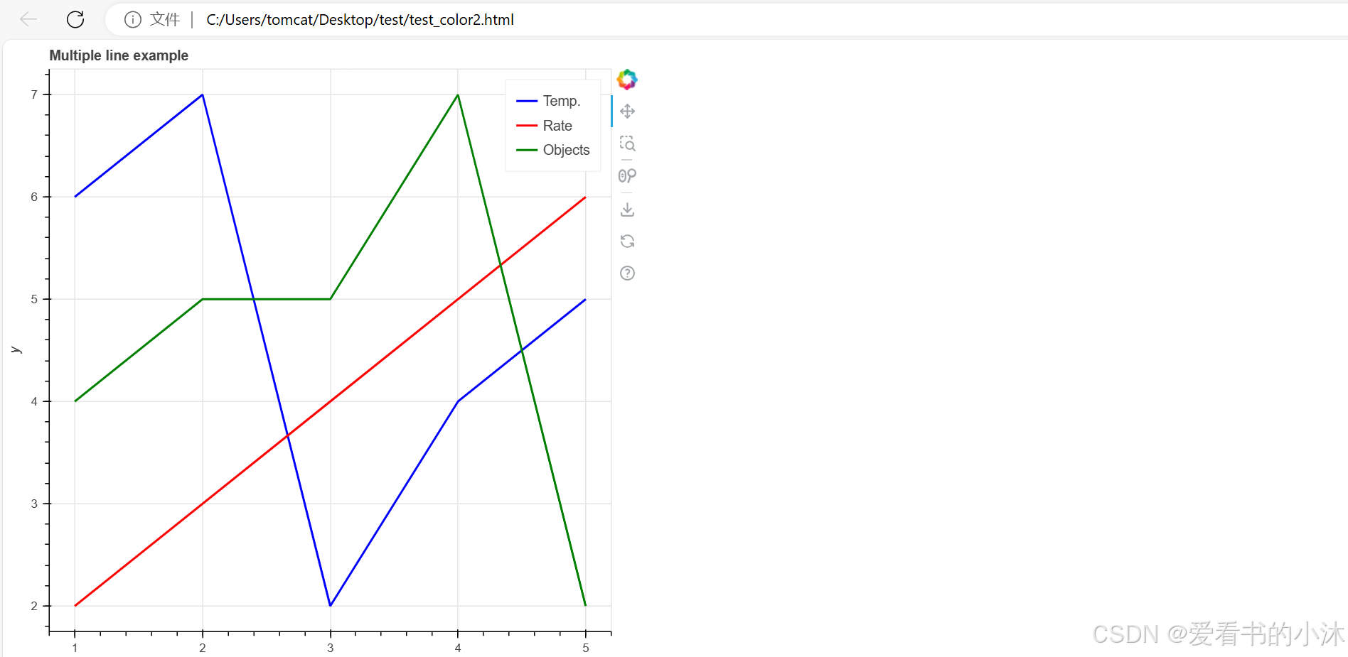
# create a new plot with a title and axis labels
p = figure(title="Multiple line example", x_axis_label="x", y_axis_label="y")
# add multiple renderers
p.line(x, y1, legend_label="Temp.", color="blue", line_width=2)
p.line(x, y2, legend_label="Rate", color="red", line_width=2)
p.line(x, y3, legend_label="Objects", color="green", line_width=2)
# show the results
show(p)
3.2 添加和自定义渲染器
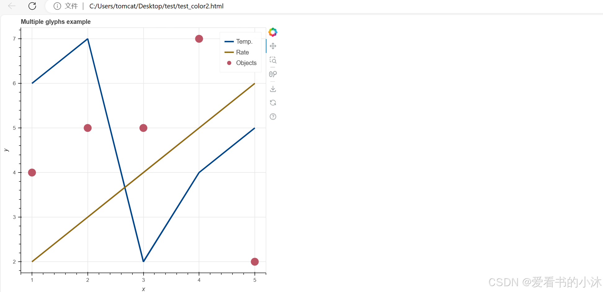
在本节中,您将使用不同的渲染器函数来创建各种 其他类型的图形。您还将自定义字形的外观。
from bokeh.plotting import figure, show

# prepare some data
x = [1, 2, 3, 4, 5]
y1 = [6, 7, 2, 4, 5]
y2 = [2, 3, 4, 5, 6]
y3 = [4, 5, 5, 7, 2]

# create a new plot with a title and axis labels
p = figure(title="Multiple glyphs example", x_axis_label="x", y_axis_label="y")

# add multiple renderers
p.line(x, y1, legend_label="Temp.", color="#004488", line_width=3)
p.line(x, y2, legend_label="Rate", color="#906c18", line_width=3)
p.scatter(x, y3, legend_label="Objects", color="#bb5566", size=16)

# show the results
show(p)
3.3 添加图例、文本和批注
from bokeh.plotting import figure, show
# prepare some data
x = [1, 2, 3, 4, 5]
y1 = [4, 5, 5, 7, 2]
y2 = [2, 3, 4, 5, 6]
# create a new plot
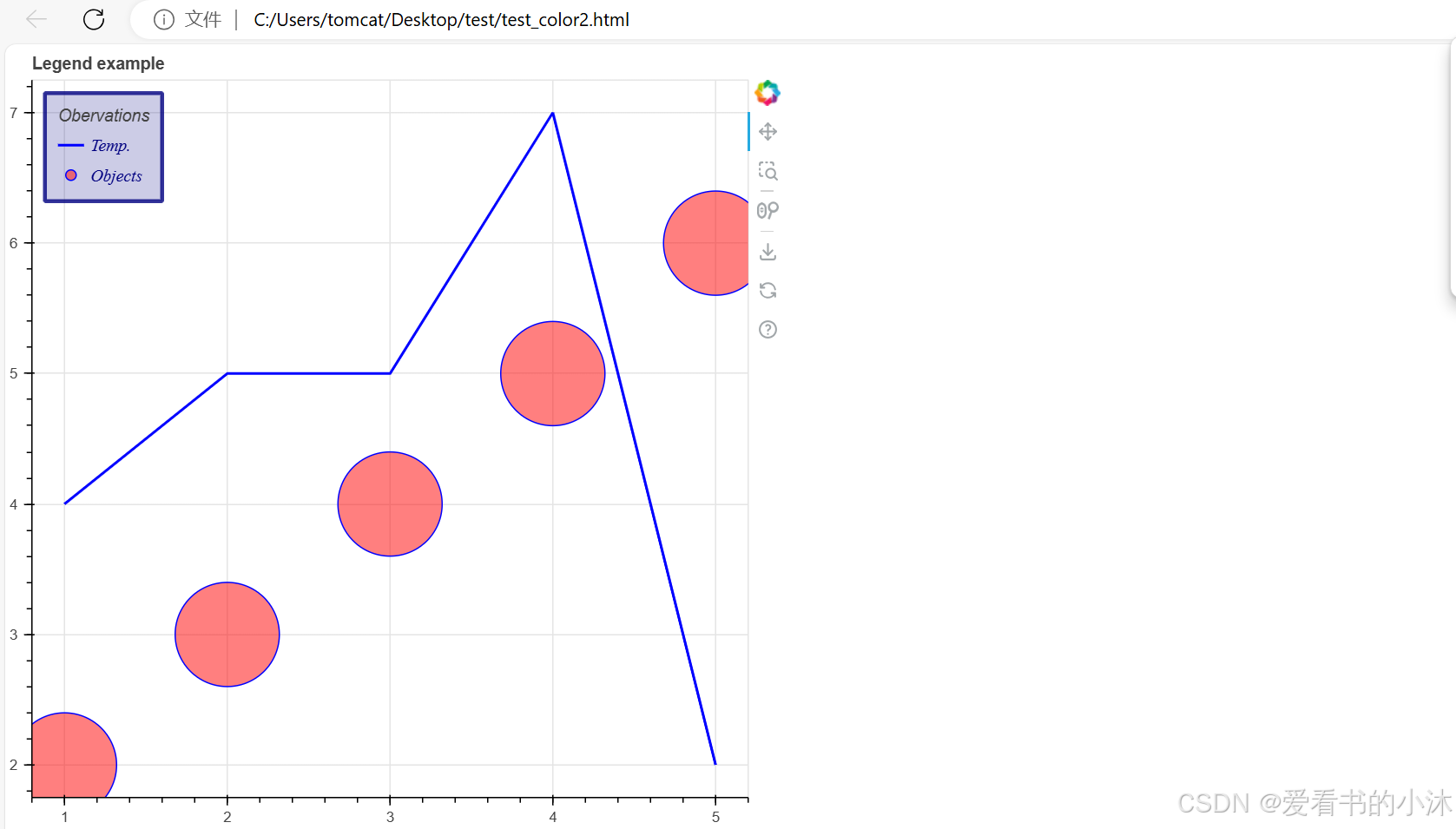
p = figure(title="Legend example")
# add circle renderer with legend_label arguments
line = p.line(x, y1, legend_label="Temp.", line_color="blue", line_width=2)
circle = p.scatter(
x,
y2,
marker="circle",
size=80,
legend_label="Objects",
fill_color="red",
fill_alpha=0.5,
line_color="blue",
)
# display legend in top left corner (default is top right corner)
p.legend.location = "top_left"
# add a title to your legend
p.legend.title = "Obervations"
# change appearance of legend text
p.legend.label_text_font = "times"
p.legend.label_text_font_style = "italic"
p.legend.label_text_color = "navy"
# change border and background of legend
p.legend.border_line_width = 3
p.legend.border_line_color = "navy"
p.legend.border_line_alpha = 0.8
p.legend.background_fill_color = "navy"
p.legend.background_fill_alpha = 0.2
# show the results
show(p)
3.4 自定义您的绘图
from bokeh.io import curdoc
from bokeh.plotting import figure, show

# prepare some data
x = [1, 2, 3, 4, 5]
y = [4, 5, 5, 7, 2]

# apply theme to current document
curdoc().theme = "dark_minimal"

# create a plot
p = figure(sizing_mode="stretch_width", max_width=500, height=250)

# add a renderer
p.line(x, y)

# show the results
show(p)
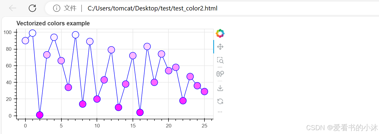
3.5 矢量化字形属性
生成了 不同的字形并定义了它们的外观。
import random

from bokeh.plotting import figure, show

# generate some data (1-10 for x, random values for y)
x = list(range(0, 26))
y = random.sample(range(0, 100), 26)

# generate list of rgb hex colors in relation to y
colors = [f"#{255:02x}{int((value * 255) / 100):02x}{255:02x}" for value in y]

# create new plot
p = figure(
    title="Vectorized colors example",
    sizing_mode="stretch_width",
    max_width=500,
    height=250,
)

# add line and scatter renderers
p.line(x, y, line_color="blue", line_width=1)
p.scatter(x, y, fill_color=colors, line_color="blue", size=15)

# show the results
show(p)
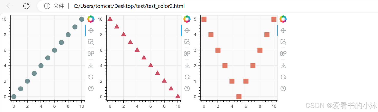
3.6 合并绘图
把多个地块组合成不同类型的布局。
from bokeh.layouts import row
from bokeh.plotting import figure, show

# prepare some data
x = list(range(11))
y0 = x
y1 = [10 - i for i in x]
y2 = [abs(i - 5) for i in x]

# create three plots with one renderer each
s1 = figure(width=250, height=250, background_fill_color="#fafafa")
s1.scatter(x, y0, marker="circle", size=12, color="#53777a", alpha=0.8)

s2 = figure(width=250, height=250, background_fill_color="#fafafa")
s2.scatter(x, y1, marker="triangle", size=12, color="#c02942", alpha=0.8)

s3 = figure(width=250, height=250, background_fill_color="#fafafa")
s3.scatter(x, y2, marker="square", size=12, color="#d95b43", alpha=0.8)

# put the results in a row and show
show(row(s1, s2, s3))
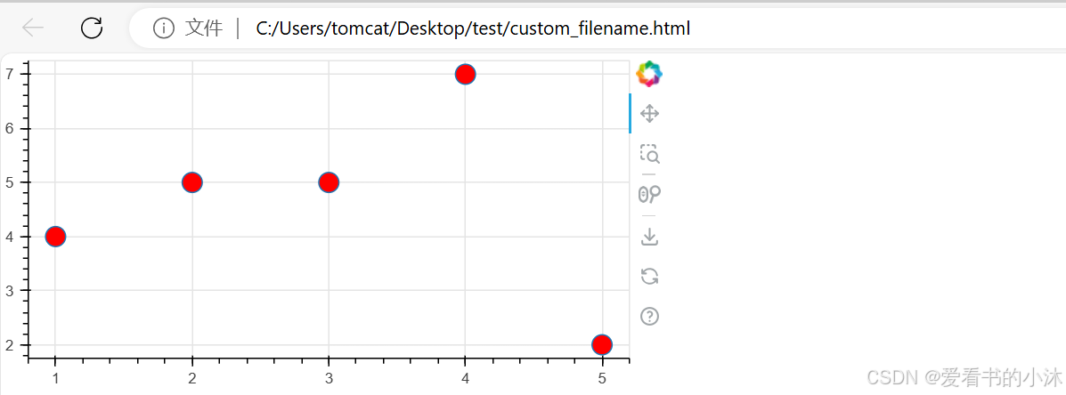
3.7 显示和导出
创建了 自定义和组合的可视化效果。
from bokeh.plotting import figure, output_file, save

# prepare some data
x = [1, 2, 3, 4, 5]
y = [4, 5, 5, 7, 2]

# set output to static HTML file
output_file(filename="custom_filename.html", title="Static HTML file")

# create a new plot with a specific size
p = figure(sizing_mode="stretch_width", max_width=500, height=250)

# add a scatter renderer
p.scatter(x, y, fill_color="red", size=15)

# save the results to a file
save(p)
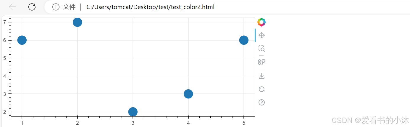
3.8 提供和筛选数据
使用了不同的 用于显示和导出可视化效果的方法。
from bokeh.plotting import figure, show
from bokeh.models import ColumnDataSource

# create dict as basis for ColumnDataSource
data = {'x_values': [1, 2, 3, 4, 5],
        'y_values': [6, 7, 2, 3, 6]}

# create ColumnDataSource based on dict
source = ColumnDataSource(data=data)

# create a plot and renderer with ColumnDataSource data
p = figure(height=250)
p.scatter(x='x_values', y='y_values', size=20, source=source)
show(p)
from bokeh.layouts import gridplot
from bokeh.models import CDSView, ColumnDataSource, IndexFilter
from bokeh.plotting import figure, show

# create ColumnDataSource from a dict
source = ColumnDataSource(data=dict(x=[1, 2, 3, 4, 5], y=[1, 2, 3, 4, 5]))

# create a view using an IndexFilter with the index positions [0, 2, 4]
view = CDSView(filter=IndexFilter([0, 2, 4]))

# setup tools
tools = ["box_select", "hover", "reset"]

# create a first plot with all data in the ColumnDataSource
p = figure(height=300, width=300, tools=tools)
p.scatter(x="x", y="y", size=10, hover_color="red", source=source)

# create a second plot with a subset of ColumnDataSource, based on view
p_filtered = figure(height=300, width=300, tools=tools)
p_filtered.scatter(x="x", y="y", size=10, hover_color="red", source=source, view=view)

# show both plots next to each other in a gridplot layout
show(gridplot([[p, p_filtered]]))
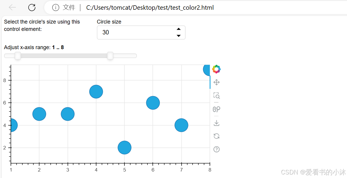
3.9 使用小部件
from bokeh.layouts import layout
from bokeh.models import Div, RangeSlider, Spinner
from bokeh.plotting import figure, show

# prepare some data
x = [1, 2, 3, 4, 5, 6, 7, 8, 9, 10]
y = [4, 5, 5, 7, 2, 6, 4, 9, 1, 3]

# create plot with circle glyphs
p = figure(x_range=(1, 9), width=500, height=250)
points = p.scatter(x=x, y=y, size=30, fill_color="#21a7df")

# set up textarea (div)
div = Div(
    text="""
          <p>Select the circle's size using this control element:</p>
          """,
    width=200,
    height=30,
)

# set up spinner
spinner = Spinner(
    title="Circle size",
    low=0,
    high=60,
    step=5,
    value=points.glyph.size,
    width=200,
)
spinner.js_link("value", points.glyph, "size")

# set up RangeSlider
range_slider = RangeSlider(
    title="Adjust x-axis range",
    start=0,
    end=10,
    step=1,
    value=(p.x_range.start, p.x_range.end),
)
range_slider.js_link("value", p.x_range, "start", attr_selector=0)
range_slider.js_link("value", p.x_range, "end", attr_selector=1)

# create layout
layout = layout(
    [
        [div, spinner],
        [range_slider],
        [p],
    ],
)

# show result
show(layout)
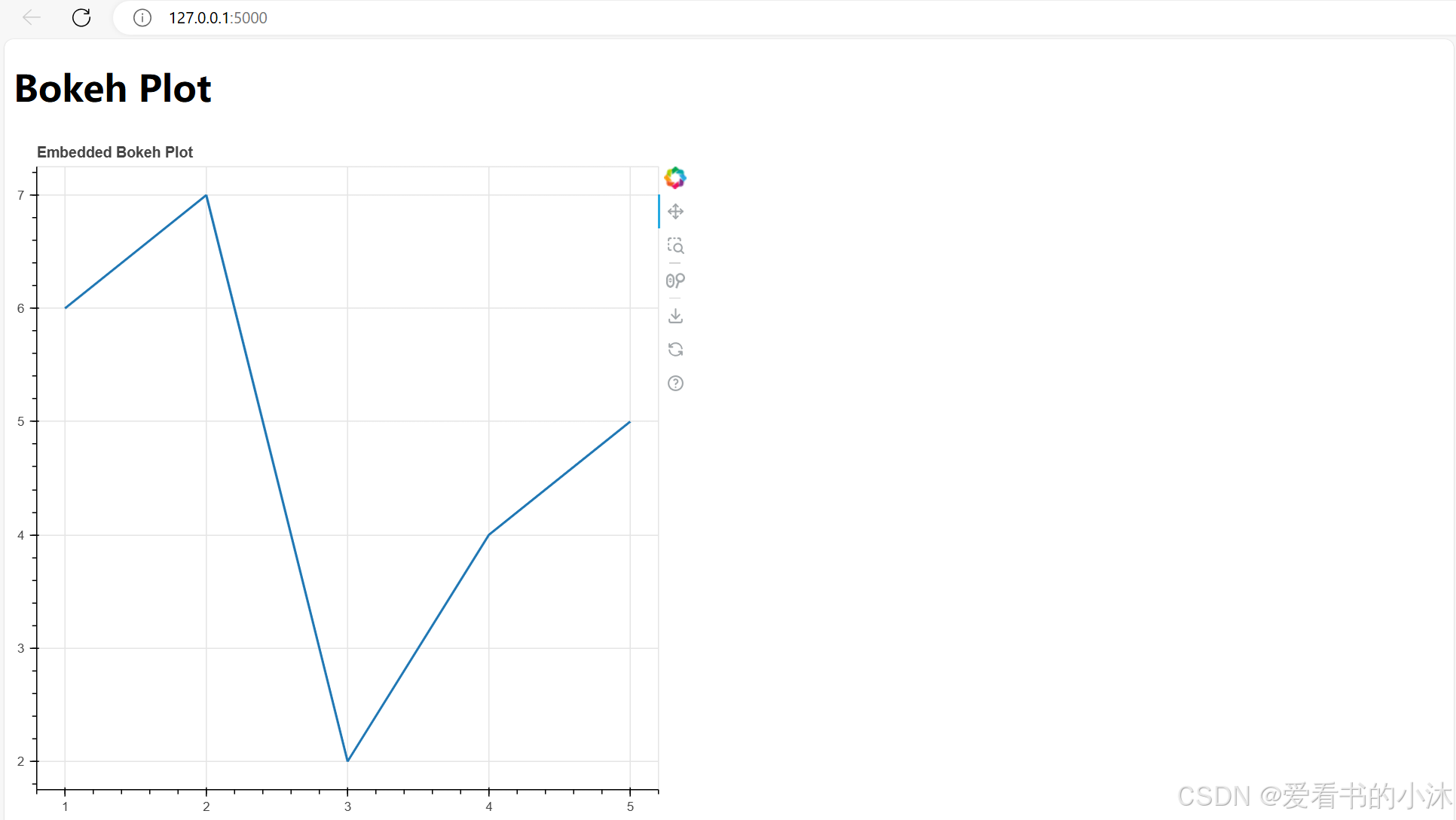
3.10 嵌入Bokeh图表到Flask应用程序
要在Flask应用中嵌入一个Bokeh应用,我们需要进行以下步骤:
- 安装Bokeh和Flask库。
- 创建一个Flask应用。
- 在Flask应用中创建一个Bokeh绘图函数。
- 创建一个包含Bokeh绘图函数的HTML模板。
- 在Flask应用中创建一个路由,渲染HTML模板并运行Bokeh绘图函数。
app.py代码如下:
from flask import Flask, render_template
from bokeh.plotting import figure
from bokeh.embed import components

app = Flask(__name__)

@app.route('/')
def index():
    # 创建一个图表对象
    p = figure(title="Embedded Bokeh Plot")

    # 添加数据点
    x = [1, 2, 3, 4, 5]
    y = [6, 7, 2, 4, 5]

    # 绘制折线
    p.line(x, y, line_width=2)

    # 将图表组件嵌入到HTML模板中
    script, div = components(p)

    return render_template('index.html', script=script, div=div)

if __name__ == '__main__':
    app.run()
index.html代码如下:
<!DOCTYPE html>
<html>
<head>
    <title>Bokeh Plot</title>
    <link href="https://cdn.bokeh.org/bokeh/release/bokeh-3.4.2.min.css" rel="stylesheet" type="text/css">
    <script src="https://cdn.bokeh.org/bokeh/release/bokeh-3.4.2.min.js"></script>
</head>
<body>
    <h1>Bokeh Plot</h1>
    <div>
        {{ script | safe }}
        {{ div | safe }}
    </div>
</body>
</html>
执行命令如下:
python app.py
结语
如果您觉得该方法或代码有一点点用处,可以给作者点个赞,或打赏杯咖啡;╮( ̄▽ ̄)╭
如果您感觉方法或代码不咋地//(ㄒoㄒ)//,就在评论处留言,作者继续改进;o_O???
如果您需要相关功能的代码定制化开发,可以留言私信作者;(✿◡‿◡)
感谢各位大佬童鞋们的支持!( ´ ▽´ )ノ ( ´ ▽´)っ!!!